Additional graphs are available from the 'Windows' menu under 'Advanced Graphs'. These are useful for analyzing datalogs and exploring the relationships between sensors.
XY Graph
The XY graph displays datalog indexed by a sensor for both the X and Y axis.
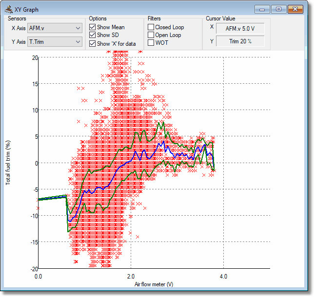
A XY graph showing the relationship between AFM airflow and closed loop fuel trim.
Options
Show Mean - shows the data mean (blue line).
Show SD - shows the standard deviation (green line).
Show X for data - shows an X for each data point.
Filters
Closed Loop - only displays values recorded when the engine was running in closed loop.
Open Loop - only displays values recorded when the engine was not running in closed loop.
WOT (wide open throttle) - only displays values when the throttle was more than 80%.
OV (overrun) - filters out values recorded during overrun injector shut off
Histogram
The histogram displays bars based on the relative frequency of the sensor data.
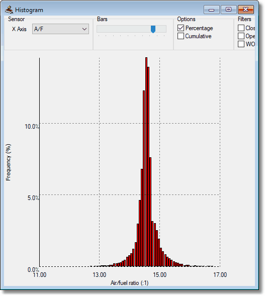
Options
Percentage - shows bar percentage rather than data count.
Cumulative - shows cumulative frequency rather than bar frequency.
Filters
Closed Loop - only displays values recorded when the engine was running in closed loop.
Open Loop - only displays values recorded when the engine was not running in closed loop.
WOT (wide open throttle) - only displays values when the throttle was more than 80%.